Let's say you have a design with different color themes for certain pages. Or maybe even for certain blocks on a single page. It's pretty common. Take this website for example. It has a page wide color theme that takes care of the title bar and the navigation. And it has a theme for individual parts of a page. I'm currently working on a site where I designed multiple color themes as well. I want the client to be able to alter this from the Statamic Control Panel. In this article I'll explain how I approach this.
The control panel
Statamic ships with a great range of fields you can put into your blueprints. I only ever use one third party field and it's Color Swatches by Rias. This is how it looks:
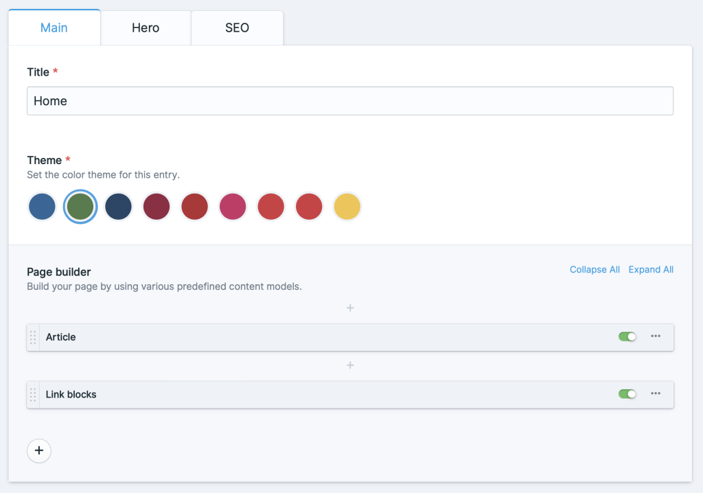
It has a clean interface and it supports multiple colors in one swatch. In this example above the field is configured like this:
1- 2 handle: theme 3 field: 4 colors: 5 - 6 label: 'Blue' 7 value: 8 - 'rgb(44 103 153)' 9 -10 label: 'Green'11 value:12 - 'rgb(79 124 74)'This page wide field is called theme. There's a label that will be used for a11y in the control panel. It's the button title and important for screen readers. Each color swatch contains an array of values. This array contains the color values for a single swatch and can consist out of multiple colors. In this example I only need one color per swatch.
The Tailwind configuration
To use themes it makes sense to put our colors in CSS custom properties. Those variables can be referenced in the Tailwind configuration files. Let's define a primary color and set the rgb value to a custom property called --color-theme.
1module.exports = {2 theme: {3 colors: {4 primary: {5 DEFAULT: 'rgb(var(--color-theme) / <alpha-value>)'6 }7 }8 }9}The <alpha-value> part makes sure Tailwind replaces this with it's own Custom Property called --tw-bg-opacity. With this in place you can use the handy opacity shorthand notation that allows you to set a color opacity when defining the color itself. This for example will render a primary background color with .6 opacity: bg-primary/60. This means that instead of the full RGB declaration like rgb(20 20 20), you need only the actual color values: 20 20 20. This is something Antlers can take care of.
The Antlers theme partial
In order to set a theme color on a page level and a block level you need to scope our CSS. In order to do so I created a partial called theme and I put it in my snippets folder. To set a page wide theme color include the partial in your <head> like this: {{ partial:snippets/theme }}.
Since the Antlers syntax highlighting will trip up within a <style> block I'll split up this partial so code is a little more legible. This is how the outer wrapper looks:
1{{# 2 @name Theme 3 @desc The theming snippet that sets CSS variables for a certain selector. 4#}} 5 6<!-- /snippets/_theme.antlers.html --> 7<style> 8 {{# The inner workings #}} 9</style>10<!-- /snippets/_theme.antlers.html -->The code block inside looks like this.
1{{ selector or ':root' }} {2 --color-theme: {{ theme.value[0] | replace('rgb(', '') | replace(')', '') }};3}This code renders a CSS block scoped to :root by default which means this CSS is available on the full page. It reads a theme variable that coming from the color swatches field. It uses the replace modifier to get rid of rgb( and ) which will leave you with just the RGB color values. Exactly what Tailwind expects. This is what the output looks like.
1<style>2 :root {3 --color-theme: 79 124 74;4 }5</style>To use this themed color you can simply use the familiar Tailwind classes like bg-primary or text-primary.
Scoped theming
Whenever you need a certain block on a page to have a different theme color just give that block in your page builder a swatches field as well.
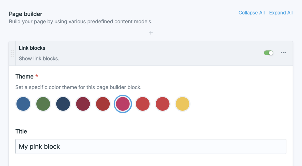
In this example I'm using the page builder methodology from Peak where are fields from the page builder replicator are scoped under :block. In the page builder partial you can call in the theme partial again but then using the scoped theme value (block:theme) and a specific selector.
1{{ partial:snippets/theme :theme="block:theme" selector="#my-specific-selector" }}This would output the following HTML.
1<style>2 #my-specific-selector {3 --color-theme: 92 186 222;4 }5</style>When you give your page builder wrapper an ID called #my-specific-selector, the value of a class like bg-primary will be the color set by the client in the swatches field for the current page builder block.
That's how to use color themes in Statamic and Tailwind CSS. However you can take it one step further with P3 color support.
P3 color support
I like to use P3 colors for browsers that support it. Currently that is only in Safari. However the CSS4 color spec is set to release soon in other browsers as well. It enables developers to use a wider color gamut on monitors that support it. Imagine how bright "Hot Pink" and "Blanched Veggies" could look. Going forward I'm assuming you know how this wide color gamut works and how to define them. If not you can read up in my article about P3 colors.
To support those bright colors update your Tailwind config file as follows.
1module.exports = { 2 theme: { 3 colors: { 4 primary: { 5 DEFAULT: 'rgb(var(--color-theme) / <alpha-value>)', 6 'p3': 'color(display-p3 var(--color-theme-p3) / <alpha-value>)' 7 } 8 } 9 }10}This adds a shade to the primary color, which means you'll able to use both bg-primary and bg-primary-p3 later on. Before that is possible, the theme partial needs some work as Tailwind expects a Custom Property called --color-theme-p3. The CSS p3 color() function expects RGB values between 0 and 1. You can let Antlers calculate this for you by updating the inner part of theme partial like this.
1{{ rgb_values = theme.value[0] | replace('rgb(', '') | replace(')', '') | explode(' ') }}2--color-theme:{{ rgb_values }} {{ value }}{{ /rgb_values }};3--color-theme-p3:{{ rgb_values }} {{ value | divide('255') }}{{ /rgb_values }};In here the RGB values are exploded into an array. The array is looped and each value is divided by 255 so they end up on the range between 0 and 1. This results in the following HTML output.
1:root {2 --color-theme: 79 124 74;3 --color-theme-p3: 0.30980392156863 0.48627450980392 0.29019607843137;4}If a browser doesn't support P3 colors it won't render any color. So you have to setup a fallback color. With this methodology that isn't possible. This is where the supports- variant comes in handy. Whenever you need a P3 background color simply add the following classes: bg-primary supports-[background-color:color(display-p3)]:bg-primary-p3. If you think this class is too verbose you can always create a custom Tailwind utility.
The supports- variant outputs the following CSS:
1@supports (background-color:color(display-p3)) {2 .supports-\[background-color\:color\(display-p3\)\]\:bg-primary-p3 {3 --tw-bg-opacity: 1;4 background-color: color(display-p3 var(--color-theme-p3) / var(--tw-bg-opacity));5 }6}This media query means the CSS is only used on browsers that support display-p3 colors. For the browsers that don't support it the regular bg-primary class comes into play.
That's how to use color themes with Statamic and Tailwind CSS. If you have any questions or thoughts please let me know.