A while back I set out to create a re-usable modal view pattern for my Statamic based sites. I wanted this view to be able to contain anything from text to images to video. Whenever I made modals before I usually created a page covering div for each modal on the page. Ideally there'd be only one of those with the content changing depending on which modal should be open. So how can we do this?
Teleport
AlpineJS has a directive called x-teleport that allows you to teleport part of your Alpine template to another part of the DOM. This teleport snippet includes your components state, even if it's teleported out of the component it originated from. This is vital if you want the modal content to remain reactive.
This is how the Alpine docs explain the directive with a code snippet.
1<body> 2 <div x-data="{ open: false }"> 3 <button @click="open = ! open">Toggle Modal</button> 4 5 <template x-teleport="body"> 6 <div x-show="open"> 7 Modal contents... 8 </div> 9 </template>10 </div>11 12 <div>Some other content placed AFTER the modal markup.</div>13 14 ...15</body>Whenever the button is clicked the inner HTML of the template tag gets teleported (or appended) to the body. The directive takes any regular JS querySelector() string.
This is exactly what we need for a modal view. Whenever a modal button is triggered we can open up a single modal view on our page and x-show the HTML part that belongs to the current modal.
Invoking the modal
I want to be able to call in a single modal component view that handles all logic. So if we create the view components/_modal.antlers.html it could look something like this.
1<div 2 x-data="{ open: false }" 3 x-cloak 4> 5 {{ partial:components/button as="button" :label="label_open" }} 6 {{ slot:attributes }} 7 @click="open = true, $dispatch('modal-open', { ariaLabel: '{{ label_aria | add_slashes | entities }}' })" 8 {{ /slot:attributes }} 9 {{ /partial:components/button }}10 11 <template x-teleport="#modal-content">12 <div x-show="open" @modal-close.window="open = false" x-transition>13 {{ slot:content }}14 </div>15 </template>16</div>What happens here is the following:
There's a new Alpine scope with a boolean property called
open.The Peak
buttonpartial gets called in so you end up with a button styled like all other buttons on your site. There are two parameters here:label_open: The label for the open button.label_aria: The aria label for the modal view.
The button partial has a slot called
attributesin which you can set custom attributes on thebuttontag. In this case it has:@click: a click listener that setsopento true.$dispatch: an event dispatcher calledmodal-openwith anariaLabelas it's data
The template that gets teleported to
#modal-contentand has the following directives:x-show: only show the content when the current component hasopenset totrue.@modal-close: an event listener that setsopento false when themodal-closeevent is triggered on the window.x-transition: to make toggling the content a little prettier.
There's a slot called
contentthat will contain the HTML that should be shown in the modal.
This component can be called in from anywhere on your site. Hard coded from a template, or maybe from a custom modal set in your Bard component. Calling in this partial looks like this.
1{{ partial:components/modal label_open="Open modal" label_close="Close modal" label_aria="Open modal" }}2 {{ slot:content }}3 {{ partial:typography/prose }}4 {{ bard_content }}5 {{ /partial:typography/prose }}6 {{ /slot:content }}7{{ /partial:components/modal }}The component is being called in with the partial tag. It has the button parameters as described above and also a label_close parameter that will be used as the label for the close button I'll get to further ahead.
We fill the slot with the typography/prose partial that handles the content styling of data coming from a Bard field. In this case this variable is called bard_content.
Rendering the modal
Let's go back to the component/_modal.antlers.html to handle the actual rendering of the modal. Below the button and teleport part we could write the following.
1{{ once }} 2 {{ section:modal }} 3 <div 4 x-data="{ 5 modalOpen: false, 6 ariaLabel: '', 7 close() { 8 this.modalOpen = false 9 $dispatch('modal-close')10 }11 }"12 x-show="modalOpen"13 @modal-open.window="modalOpen = true, ariaLabel = $event.detail.ariaLabel"14 @keydown.escape.window="close()"15 x-trap.noscroll.inert="modalOpen"16 role="dialog"17 :aria-label="ariaLabel"18 aria-modal="true"19 x-cloak20 class="fixed inset-0 p-4 z-50 flex justify-center items-end md:items-center"21 >22 <div23 x-show="modalOpen"24 @click="close()"25 class="absolute inset-0 bg-black/80"26 x-transition.opacity.duration.400ms>27 </div>28 <div29 x-show="modalOpen"30 class="relative w-full p-4 md:p-8 max-w-2xl max-h-[calc(100vh-2rem)] rounded-lg bg-white shadow-lg overflow-auto"31 x-transition32 >33 <div id="modal-content"></div>34 <div class="pt-6 flex justify-end">35 {{ partial:components/button as="button" :label="label_close" }}36 {{ slot:attributes }}37 @click="close()"38 {{ /slot:attributes }}39 {{ /partial:components/button }}40 </div>41 </div>42 </div>43 {{ /section:modal }}44{{ /once }}At the core of this methodology lies the once tag which makes sure the template parts in between the tag are only rendered once. This is important. No matter how many times we call in this partial, the actual JS logic, HTML tags and styling is only added to our page once. Further down the logic is wrapped in a section tag which I'll get to later.
After that we create a new Alpine scope with three properties:
modalOpen: a boolean for the modal open/close state used further down inx-show.ariaLabel: an empty string to use as anaria-labelon the modal container.close(): a function that closes the modal and dispatches theclose-modalevent to the modal trigger component so the content of the current modal can be hidden.
Whenever the modal-open event is triggered from the open button modalOpen is set to true by the following logic: @modal-open.window="modalOpen = true, ariaLabel = $event.detail.ariaLabel". This also sets our ariaLabel property with the aria_label parameter we fed to the {{ partial:components/modal }} tag earlier. Whenver the escape key is pushed @keydown.escape.window="close()" makes sure the close functions triggers.
For accessibility it's important to add a few more attributes to the modal.
x-trap.noscroll.inert="modalOpen": Focus trap the modal content when it's open.role="dialog" aria-modal="true": Inform the accessibility tree that this container is adialogand amodal.:aria-label="ariaLabel": Bind theariaLabelproperty from the current event to thearia_labelattribute.
And finally within the modal markup we have an element with id="modal-content" where the contents get teleported to and a close button that uses the previously defined label_close parameter as a label.
That section tag I mentioned earlier means that somewhere else on our site we have to yield this template part for it to be available in the rendered HTML. I use this to keep all modal logic tied together in one partial. You can yield the section in the layout file. This is a simplified example of my layout.antlers.html.
1<!doctype html>2<html>3 <body>4 {{ template_content }}5 {{ yield:modal }} 6 </body>7</html>The complete partial
When everything is combined the final partial looks like this.
1{{# 2 @name Modal 3 @desc The modal component. Make sure to `{{ yield:modal }}` in your layout file before closing the `<body>`. 4 @param* label_open The invoke button label. 5 @param* label_aria The modal `aria-label`. 6 @param* label_close The close button label. 7#}} 8 9<!-- /components/_modal.antlers.html -->10<div11 x-data="{ open: false }"12 x-cloak13>14 {{ partial:components/button as="button" :label="label_open" }}15 {{ slot:attributes }}16 @click="open = true, $dispatch('modal-open', { ariaLabel: '{{ label_aria | add_slashes | entities }}' })"17 {{ /slot:attributes }}18 {{ /partial:components/button }}19 20 <template x-teleport="#modal-content">21 <div x-show="open" @modal-close.window="open = false" x-transition>22 {{ slot:content }}23 </div>24 </template>25</div>26<!-- End: /components/_modal.antlers.html -->27 28{{ once }}29 {{ section:modal }}30 <!-- /components/_modal.antlers.html -->31 <div32 x-data="{33 modalOpen: false,34 ariaLabel: '',35 close() {36 this.modalOpen = false37 $dispatch('modal-close')38 }39 }"40 x-show="modalOpen"41 @modal-open.window="modalOpen = true, ariaLabel = $event.detail.ariaLabel"42 @keydown.escape.window="close()"43 x-trap.noscroll.inert="modalOpen"44 role="dialog"45 :aria-label="ariaLabel"46 aria-modal="true"47 x-cloak48 class="fixed inset-0 p-4 z-50 flex justify-center items-end md:items-center"49 >50 <div51 x-show="modalOpen"52 @click="close()"53 class="absolute inset-0 bg-black/80"54 x-transition.opacity.duration.400ms>55 </div>56 <div57 x-show="modalOpen"58 class="relative w-full p-4 md:p-8 max-w-2xl max-h-[calc(100vh-2rem)] rounded bg-white dark:bg-neutral shadow-lg overflow-auto"59 x-transition60 >61 <div id="modal-content"></div>62 <div class="pt-6 flex justify-end">63 {{ partial:components/button as="button" :label="label_close" }}64 {{ slot:attributes }}65 @click="close()"66 {{ /slot:attributes }}67 {{ /partial:components/button }}68 </div>69 </div>70 </div>71 <!-- End: /components/_modal.antlers.html -->72 {{ /section:modal }}73{{ /once }}Demo
On this site I created a new Article (Bard) set called Invoke modal by running php please peak:add-set and setting up some fields so I can define the various labels and the modal content straight from the control panel. The set is added to the page right here:
Shrimp

Anyway, like I was sayin', shrimp is the fruit of the sea. You can barbecue it, boil it, broil it, bake it, saute it. There's uh, shrimp-kabobs, shrimp creole, shrimp gumbo. Pan fried, deep fried, stir-fried. There's pineapple shrimp, lemon shrimp, coconut shrimp, pepper shrimp, shrimp soup, shrimp stew, shrimp salad, shrimp and potatoes, shrimp burger, shrimp sandwich. That- that's about it.
Try it yourself
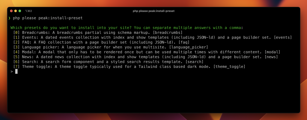
Since last week Peak ships with an addon that contains the full CLI helpers. One of these helpers is the php please peak:install-preset with which you can install all kinds of modules to your website. Peak takes care of the boring stuff so you can focus on styling it. One of these presets is this very modal component.
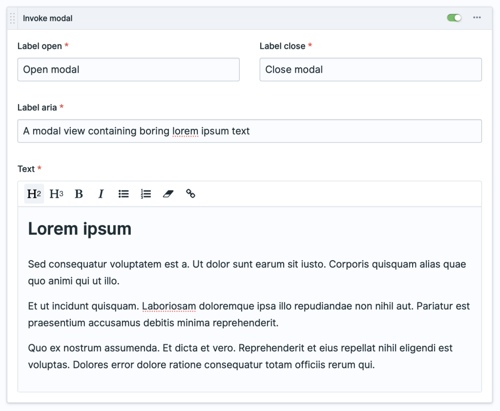
The preset also installs a set into the page builder article block so you can quickly add a modal to your page. This is how it looks.
And that's one way of handling modals with Statamic and Alpine. If you have any questions or thoughts please let me know.